If you are taking on a new business venture or rebranding in 2019 you’ll want to get your branding just right, to give customers and clients the best first impression, but also to make you stand apart from the crowd. We have looked into what branding trends are set to be big for 2019 and listed some important considerations to help you get your branding and logo design on point for the new year.
Colour Me Happy
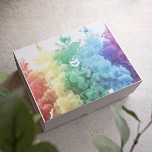
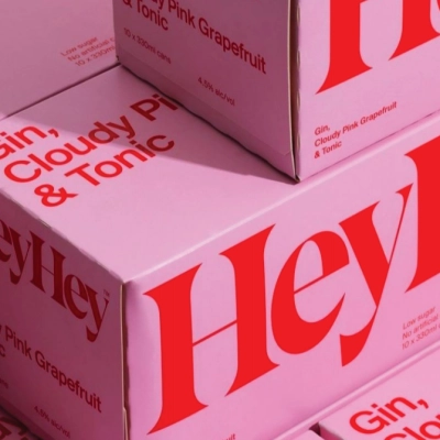
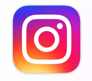
Using bright, hard colours is becoming increasingly popular, especially in the entertainment and media industries. These strong and punchy shades grab your attention and are almost impossible to ignore in the right context. But that’s not to say there isn’t still a place for other tones as well as classic monochrome branding. Think about what you are selling and build a picture of how you want to be perceived. Colour can be incredibly emotive; the use of colour alone can transform a logo from being cheerful and positive to being dull and drab. Using several colours is a possibility, and ensuring those colours sit well together is important. Employing the use of gradients, colour overlaps and coloured backgrounds can make all the difference in getting you noticed; take the Instagram logo for example which uses bold colour along with a gradient and a negative space cut out.
Shape Up
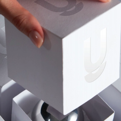
The use of geometric shapes in branding is set to be big for 2019. The simplicity of regular, clean lines that are easy on the eye and not over fussy and combining different geometric shapes to create balance visually. From a technical perspective this is incredibly basic however it creates endless possibilities and works brilliantly for businesses who have a varied target audience. The simplicity of using geometric shapes can provide great flexibility in terms of changing your logo as your business evolves and develops. The Zendesk logo is a perfect example of where simple geometric shapes have been compiled into the shape of a ‘Z’.
Font Type
Excuse the pun, but it’s important to think about what ‘type’ of font will best represent your business. 2018 has been a period of text-based logos, which has really encouraged people to experiment with different fonts and to get clever with them.
Your chosen font is often something that remains consistent on other marketing materials you may employ, such as your website, newsletters, social media etc. How will the font you choose look alongside any imagery you might be using?
There are also other factors to consider where fonts are concerned, for example: Will you be replacing any of the letters in your logo with a symbol or graphic as part of your branding? Have you thought about combining two or more different fonts to create your desired effect? Will you be using kerning, indents or overlapping in any text that might be in your logo? The NARS logo is a great example of simplicity whilst utilising overlapping text.
Function over Form
Whilst the design of a logo is extremely important when trying to convey the right message, the functionality of a logo is equally important.
The key thing to remember is what is the logo going to be used for? You, of course, want to create brand recognition but are you wanting your branding to depict exactly what is it you are doing or selling, or is being ambiguous a better avenue to take to create intrigue from those who see it? Will remaining ambiguous with your logo design be more beneficial in the long run if your business ends up changing or transcending? It’s also worth thinking about whether you will you be having a full logo, and then a smaller or more simplified version of it when the full version may be a bit much, and if so will your design accommodate both options. Examples of this are Deliveroo’s full logo with the text, and then its smaller version which is just the kangaroo’ head or GymShark’s full logo with the shark head graphic and text, and then just the shark head graphic on its own.


Devil’s in the detail
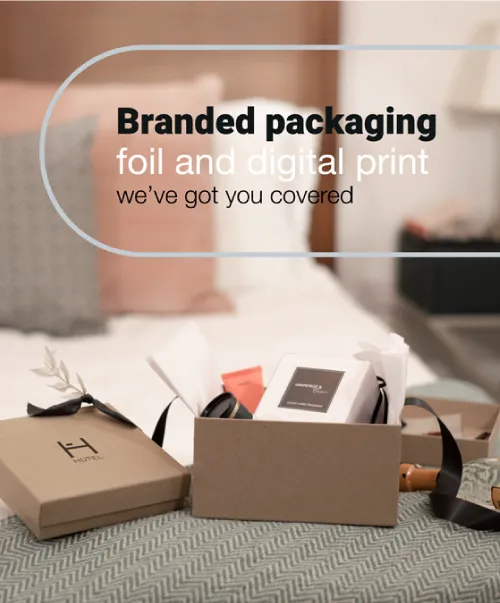
The trend for branding in 2019 is set to be simplicity, keeping things clean and uncomplicated. However, that shouldn’t stop you from using detailed and complicated designs if this is what best suits your brand. It’s worth contemplating what media you might utilize when marketing your business. A complex and intricate logo design is not always a suitable option for hot foil printing, i.e. the hot foil printing process we offer, but would be fine if you are only likely to want digital printing. Do your best to also put thought into your audience, a small and highly detailed graphic may not be best suited to a brand which is aimed at young children or the elderly for example.
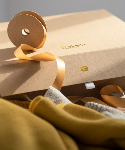
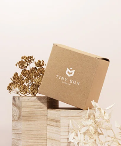
A well-planned logo is an advertisement in itself, so ensure you have really thought it through, using a designer who can get on board with your ideas is paramount. Here at Tiny Box Company we offer a full logo design service where we can work with you to create a design that best represents your business. We can then use that logo to hot foil print on a wide variety of gift boxes and paper gift bags, as well as foil printed ribbon and full colour digitally printed labels.
A companies branding can convey the message of whether they are a big corporate company or a small independent – and it’s worth remembering here that there are pros and cons to both, and that considering the relationship you want to have with your consumers is vital in shaping your brand.
