|
How many brands do you look at and know within a nanosecond what it is - for instance look at Google - as soon as your eye spots those primary colours you know straight away that it's them, and if you don't then maybe it's time to crawl out from under that rock. When it comes to creating a brand there are so many details to think about: the colour, name, logo, design, size/positioning, too many in fact to think about. To make your head a bit clearer about how our brain processes a brand and the psychology behind it we interviewed Abigail Turner. Abigail is currently studying for her Doctorate in Counselling Psychology. Read through our interview to give you some insight into how our brain processes a brand.
How long have you been studying psychology? I have studied psychology since 16 when I was able to select it for A Levels. I completed my BSc in Psychology, completing a dissertation on neurological processing and priming to stimuli, and went straight into a foundation certificate course for skills in counselling and psychotherapy. In my mid 20s, whilst balancing paid work and voluntary work which related to psychology (it is very difficult to get psychology roles let alone paid ones before qualification) I completed my Master’s in Psychology with research methods. I have since been studying for my Doctorate in Counselling Psychology, of which I have completed the clinical and teaching components and just need to finish my thesis on the intersectionality of race and gender in order to qualify and receive chartered status. I am working alongside this in an NHS psychology team full-time.
When did you know that you wanted to study psychology? What interested you in becoming a psychologist? If I recall correctly, I was interested in psychology from about the age of 14. I became aware of it as a subject when talking about options after GCSE completion, and I knew I was going to prioritise it in my options. I had an excellent A level teacher, who gave me a firm foundation in psychology from a wide range of disciplines. I was interested in studying psychology because I was very curious about what led people to behave in the way they do, or how certain thinking processes are formed. I was very sensitive to the emotions and actions of others, and from a young age good at listening to people and helping provide comfort. Curiosity drew me to the scientific research aspect of psychology, and a drive to understand, whilst my personal qualities drew me towards the specific area of counselling psychology and giving therapy.
What interests you most about your field of work? I love getting to know the people that I work with, and even though I may be looking at a group of people with the label ‘anxiety’ for example, there is so much variety in how it affects them, different methods of helping them depending on their needs and processing styles, and a rich context behind each person. It is never boring as I am viewing each person as an individual which I apply to wider constructs of working, but is tailored to each individual. I also like the journey towards understanding that I will go on with my clients, as we both try to unpick and process whatever it is they are wanting to discuss in therapy, as again it is so varied. This is also why I value research in psychology greatly, as with increased knowledge we can help people to understand their circumstances better and improve their wellbeing. It also has implications on wider societal impacts, from decision making and behaviour influence, to the rights and treatment of people, especially those who are disadvantaged.
How does the brain process colour? Receptors in the eye pass this information along neurons to an area of the brain called the visual cortex. Different combinations of neurons respond to different colours and shapes, and can do this simultaneously for when you are observing more than one type of visual stimulus so you can process them at the same time. There is some slight variation in how some colours get processed between people, which is how we can get different types of colorblindness, but we also culturally and linguistically have more names for describing colours of warmer hues than the cooler hues. Beyond the neurological processing of colour, there is a psychological level to the processing of colour where we have our own meaning to certain colours, associated with emotions, memories and even social influences. On a generalised level, certain colours can be associated with certain cultural meanings and symbolism, such as red being for love and heat, blue for sad and cold, green for feeling sick, and these are associations we will ingrain on a subconscious level from an early age. However, this isn’t as simple as social theory of colour, it is also affected by our own experiences and conscious social resistance (e.g. steering away from the stereotypical gender binary of pink for girls, blue for boys). If I have a family member who I feel very close to, and they always wear yellow when I see them, I then associate that feeling of love and warmth to yellow and it becomes a colour with positive association and will respond to yellow accordingly - yellow isn’t just lemon and sunflower (generally neutral stimuli), it is also my family member who I associate with the colour who I care for deeply. Alternatively, it could be a member of the family who I really don’t get on with and end up associating yellow with them and therefore try and avoid it going forward! We can’t really control the personal shaping of peoples’ associations to colours, but we can use societal generalisations as much as we can to try and appeal to the consumer. It also matters what intensity or hue we choose, as a neon green will not have the same impact as a subtle and soft natural green. There are many factors to consider in the processing of colour, and it isn't possible to completely detangle what is conscious or subconscious processing of colour which leads to our individual automatic responses to a particular colour.
What power does a brand have over the consumer? Our brains like to create shortcuts. One of the ways in which this can be formed is through familiarity. When recognising a brand we aren’t looking for ‘a technology company that produces high end phones and computing devices’ etc etc instead we would see the Apple symbol and immediately recognise the brand without seeing the name or think ‘oh, that’s that tech company’ - Apple stores don’t even say as much, they just have the logo at the front of their stores. What about the instantly recognisable ‘Swoosh’ that represents Nike (they also mostly do not label their stores with the name, just the logo)? These sleek and simple designs are easy to remember. If a brand logo looked like a QR code you wouldn’t be able to automatically remember the details (it is said there are more possible permutations of QR codes than there are atoms in the universe). Once we recognise the brand, then we are led to similar processes that we would with processing colour. A brand is not just a name or a logo. It has different meanings for each person, depending on their values, ethics, budgets, personal experiences and much more. Brands represent more than just a product, they can mean aspiration, dreams and goals. If someone aspires to a certain figure who is sponsored by or representing a specific brand, it makes the brand something more attractive. It means that that person can be closer to the person they aspire to be by possessing the same products or consuming the same brand. However likely it may or may not be for someone to reach the levels they aspire to, striving for a goal drives that consumerism. I will never be a world famous record holding sprinter like Usain Bolt, but I could wear Puma branded products to feel like I am closer to the qualities I may admire in him and aspire towards. Or it could be my priority to be seen as a certain class or status, so I will make it my objective to buy designer products - something as simple as a black handbag becomes vastly more expensive all because of the brand name and logo printed on it. It all depends on what is more important to each consumer, and brands thrive off the human needs of belonging, power, status, and life goals to help people feel like they are living according to these aspects, and that is why brand representation can be such a powerful thing. What does a specific brand mean to a specific person? Golden arches are synonymous with fast food - for one person that may mean poor health, for others comfort food. A certain football team is sponsored by a specific brand - a fan would be more likely to seek out the brand whereas a rival may choose to avoid it. There is no one straightforward answer which is why brand competitiveness is so strong.
Why does nicely presented or branded packaging have a different effect on the consumer over plain packaging? As mentioned, brand is more than just appearance. The way people build data about a brand is informed by emotions, values, memories etc. which all take on a different meaning and when consolidated lead to a specific opinion by a consumer for a particular brand. Something that is nicely presented is going to appeal more to the consumer because they will associate it with positive memories and emotions - they aren’t going to pick a packaging with negative imagery, such as diseased lungs on cigarettes (the reason people would still pick negative imagery is a separate topic). People will be drawn to what makes them feel good and the things that appeal to their values. If people are presented with plain packaging their brain is not going to engage the emotional and more automatic processes that draw attention. Brands will therefore lose out to packaging that is more eye-catching or conveys more key information in an easy to absorb way. It can also convey the message that not much thought or effort has been placed into the development of the product, so why would someone choose to trust a product that isn’t trying to sell itself?
Packaging is the first thing people see when they purchase a product, what is the importance of capturing a customer's attention straight away? We are making decisions all the time, sometimes multiple at once. To conserve our energy we want to put as little effort into these as possible, so we use biases and shortcuts to help us make a choice (some of which are called heuristics). These are automatic processes that prevent brain strain because they are done quickly. If you are in a supermarket and see cheddar cheese for example, you get something like 10 choices. Grated or block? Price, intensity of flavour, then brand. If we were to make a full analysis of each product and weigh up pros and cons grocery shopping would take all day. To bypass this we have certain biases that determine how much value we place on certain features of the product we are looking for. For some people, value for money may be more important than, for example, extra mature organic cheese which is pricier. For those people who do not come prepared with criteria to meet or those who value the appeal of appearance over other factors, it is important for the packaging to catch their attention first. We see the packaging before any of the other details - price, ingredients, etc. Processing the packaging is done in seconds, and we will be drawn to certain aspects that we find appealing - some people may have certain colour preferences, or maybe the wording quickly conveys the sought information, or even clear labelling, for example, a symbol or wording that clearly shows vegan, vegetarian, halal, etc. The key is to maximise the attractiveness and detail in as little time and effort as possible. If the packaging is appealing and engaging enough, the consumer will not be spending extra time considering other brands (unless that is the priority because something like cost is more important) and they will choose the most accessible option to meet their requirements rather than spend time pouring over details of other packaging.
With your knowledge of colour and brand psychology from a marketing perspective, what advice would you give to our customers who are looking to enhance their brand with printed packaging? Maximise the details that are important to the consumer in as simple and effortless way as possible. Identify key messages you want to convey on first glance to the consumer and find a way to make these the primary features of packaging. You want to be picking one or two priority features you are wanting to communicate instantly, as too much information will be overlooked and the consumer is less likely to invest time in analysing the in depth details of the product. They are likely to pick it up for a closer look with appealing aesthetics, and unique or stand-out selling points, conveyed through information on the product in an easy to absorb format. You want consumers to associate your brand with positive features so you want consumers to see your packaging and think of all those positive experiences they have had with the brand. If you are changing frequently or being inconsistent with packaging, the associations are not going to be built up in the mind of the consumer and therefore they are not going to be building up these shortcuts and opinions of the brand that would ensure future patronage.
Abigail Turner MBPsS
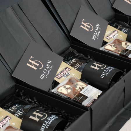
Feeling inspired? Has this inspired you to want to showcase your brand in all areas? Let's start with your packaging. Adding your logo onto the top of your box will grab your customers attention straightaway and build a story about your brand before your customer has even opened their box. To find out more about our digital printing and foil printing for your boxes click below... |

