Colour is seriously important in branding and presentation. It’s easy to get lost in the vast sea of colourways, so we thought it would be useful to give a rough guide of colour trends for 2020.
A lot of colour inspiration is taken from the fashion industry and walks at a similar stride with the interior design market too.
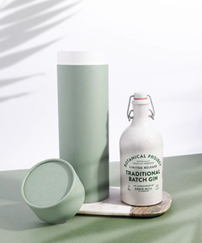
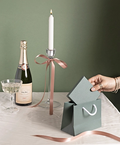
Keen to be Green
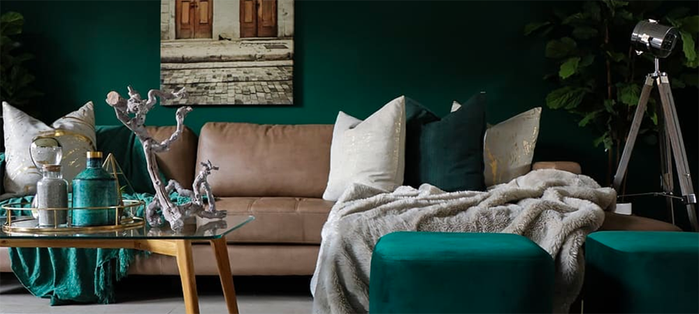
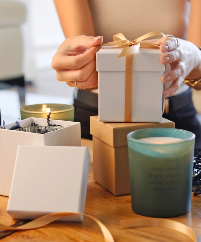
It’s essentially unavoidable, with all of the talk surrounding the environment (rightfully so), people are warming up to nature and including a lot of leafy green tones to their homes, wardrobes and branding.
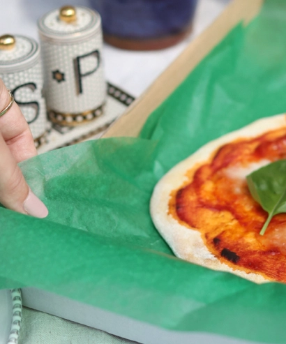
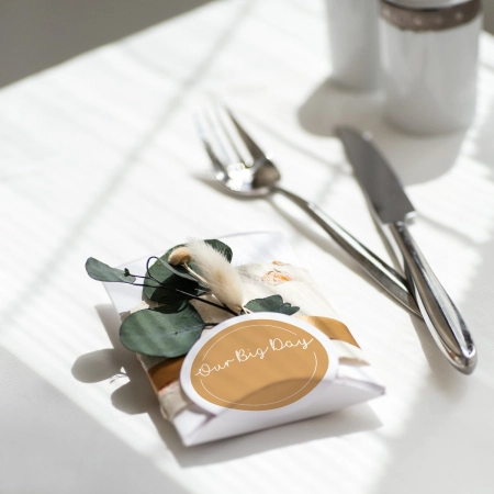
The richer the green, the better. Emerald, Olive, Teal and Seafoam - all worthy choices.
For winter 2020, you’ll find hunter green, grey green, bronze green and emerald green at the forefront.
A great example of this green colourway can be found in our cotton bag collection and our recycled tissue paper.
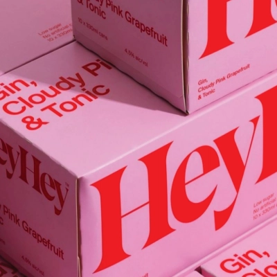
Pink makes the boy wink ;)
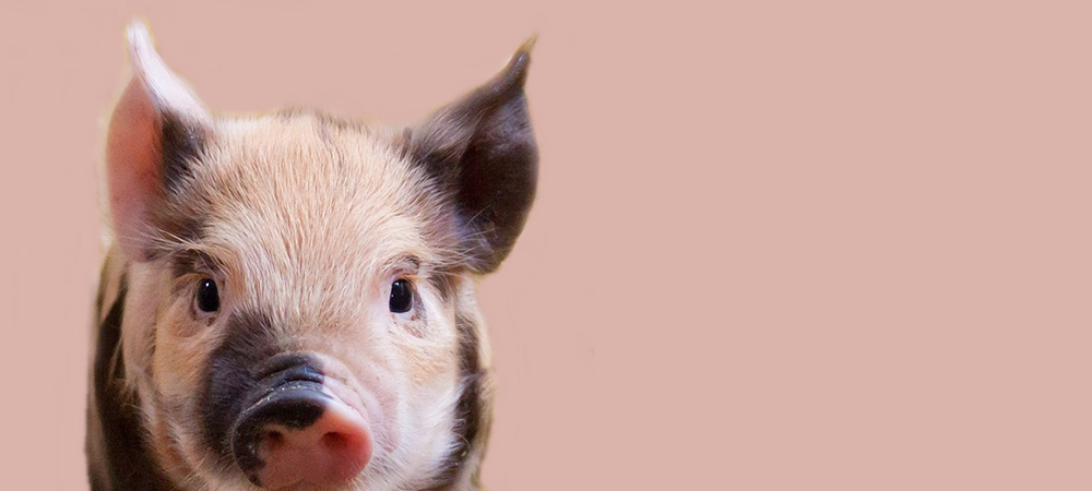
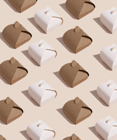
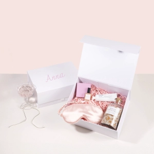
You may remember millennial pink from 2016 and 2017 - its back and it’s fighting for attention in 2020. Also seen in the shades, dusty pink and powdered pink, these pastel colours are certainly on trend again. We aren’t complaining!
The pastel colour is elegant and works hand in hand with bolder colour palettes.
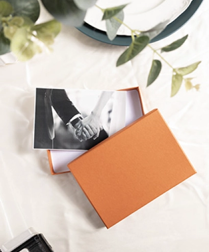
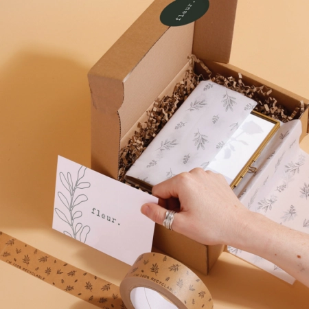
We offer a millennial pink in our recycled tissue paper, ribbons, bags and kraft boxes.
Take a peek at the selection - we won’t tell anyone!
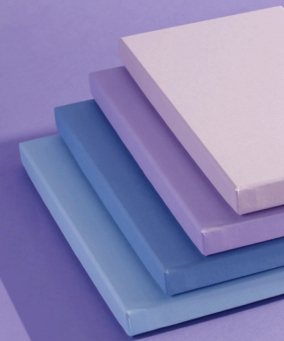
This Blue won’t make you sad
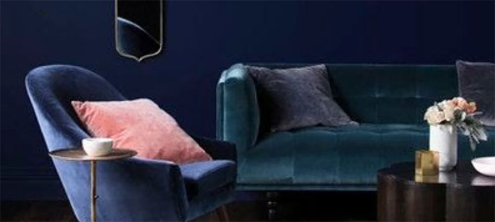
Picture by lonny.com
And some said blue wasn’t going to be popular this year… our pantone colour of the year says differently. Classic Blue is elegant in its simplicity whilst also bringing a sense of tranquility.
The other blues on trend for 2020 include sapphire, navy and royal blue. The general rule is, if it’s a gemstone colour - it will work. Blue is usually considered to be quite a calming colour which, in branding, also transcribes stability and trust with your customer.
We’ve got you covered for tissue paper, cotton bags and kraft boxes in this trend setting colour of the year.
Did someone say Aubergine?
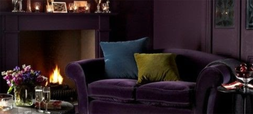
Picture by sofa.com
The aubergine/purple colour has made its way onto the trend chart for 2020 via the interior design market. Velvet finishes on soft furnishings have made aubergine all the rage.
Dark purple is normally associated with royalty and luxury but can be played down with tonal colours. Think Cadbury’s Dairy Milk, their packaging is approachable and appealing which matches their marketing and tone of voice.
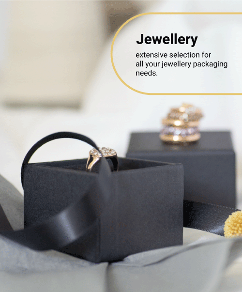
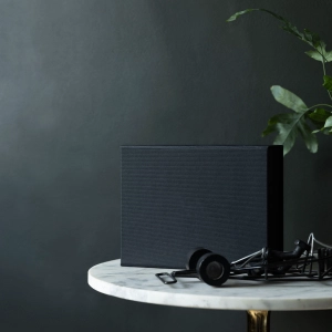
Back in Black
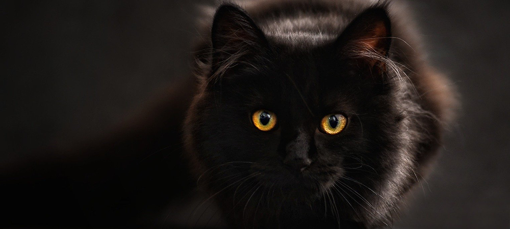
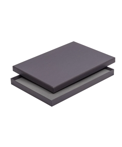
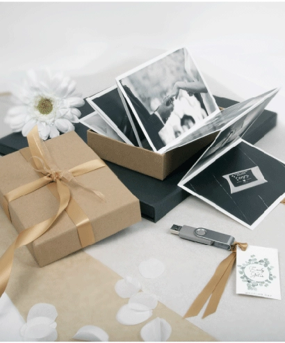
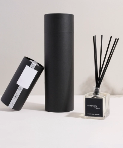
Black doesn’t have to be boring. Black can be luxury, black can be chic and sophisticated.
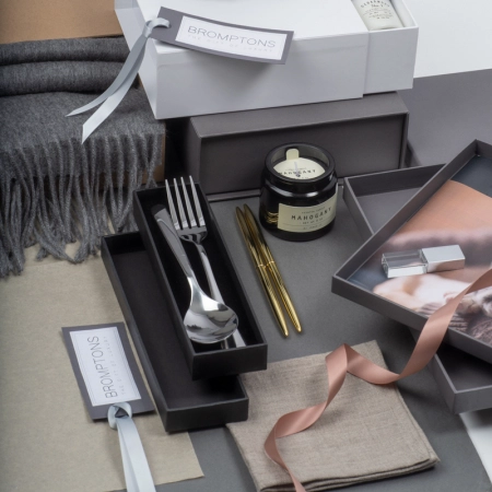
It goes with anything. It highlights pastels and metallics and contrasts beautifully with white and silver.
In branding, black is powerful, it’s clean and it’s striking, however, can also be used subtly too. Think of brands such as Apple, Sony, Adidas. All have black logos and all strike a feeling of power and authority.
We offer a huge range of boxes in black, most of which can be foil printed to add an extra elegance to your packaging. If you’re interested in having a black foil logo, why not browse our white gift boxes for a striking, lasting impression, or go black foil on a black box for a subtle and modern approach.
Colour is so important in branding and packaging, it’s where the first impressions of customers are based. Colour is more than just a visual aid, it also conveys emotions and feelings. So when you are thinking about starting up your new business - consider your colour palette as a priority - it may just make you stand out from your competition.
If you need help on branding advice, speak to Charli!
Charli is our in house graphic designer and has an abundance of knowledge in logo design.
You can contact her at this email address - she’d love for you to say hi!
[email protected]

